Here are some inspiring book covers I would like to adapt a website to.
The Fault In Our Stars
http://www.amazon.com/Fault-Our-Stars-John-Green-ebook/dp/B005ZOBNOI/ref=sr_1_4?s=books&ie=UTF8&qid=1398800152&sr=1-4
The Thing With Feathers
http://www.amazon.com/Thing-Feathers-Surprising-Lives-Reveal-ebook/dp/B00DMCVZHK/ref=sr_1_33?s=books&ie=UTF8&qid=1398800301&sr=1-33
Parentology
http://www.amazon.com/Parentology-Everything-Science-Children-Exhausted-ebook/dp/B00DPM7XBY/ref=sr_1_141?s=books&ie=UTF8&qid=1398800438&sr=1-141
Tuesday, April 29, 2014
Thursday, April 24, 2014
Unit 2 Reading Response
The reading this week included how to pretty much dumb down a website/billboard design and simplify it to the point where users don’t have to think. The title of the textbook is quite fitting! I thought it was interesting how many websites have bad design choices! Seeing what Krug said about the MSNBC website menus makes it a lot clearer to me to NOT DO WHAT THEY DID. But also that New Hampshire political candidate, Hatch’s webpage was horrid, and Krug made it very clear that that page consisted of a lot of designer “don’ts”. Another part I found very interesting and helpful was when Krug says that the search bar on that one website was not clear; it shows that the designer needs to think in order for the user to have an easier experience. That is definitely something that I can run with and use in my future designs. Let me just say something about “happy talk”. Alright, I thought it was just common sense to not have a caption for everything. I suppose that some designers don’t understand the uselessness of having an explanation for everything. I think the internet has been around long enough that people don’t need directions or an information-lacking preface on their website.
Here are some links to websites that don't have clear visual hierarchy or organization in links/colors/text.
Monday, April 14, 2014
Unit 1 Reading Response
Don’t Make Me Think? These two chapters have made me think a lot! I’m fascinated by the way we, the designers, and the users perceive webpages differently.
When I design a webpage, my first thought is to make it very user-friendly, and more or less, simple. I do see how I, the designer, view the contents and layout of a webpage, I focus on the color relationships, text relationships, if the space between the menu buttons are too close or too far apart, etc.. But then I put myself into the user’s shoes and looked at a site like Amazon.com, for instance. I immediately look for the search bar, then I panned the bold ads that are in the center of the screen, then up to the left corner where their logo is. I’m familiar with this site, so I suppose it’s not as hard to decipher compared to a brand new user.
I see this to be like a silent movie that everyone has made their own script to, and here (the textbook) we have the script, the blatantly obvious script to how we use webpages and the internet in general. What I get from how we scan pages rather than read them, is that it’s completely true. ‘I came [to this webpage] to find something and I don’t want to waste my time looking at other things besides that’ and I think it’s unfortunate how in this day and age, we are constantly in need of immediate satisfaction.
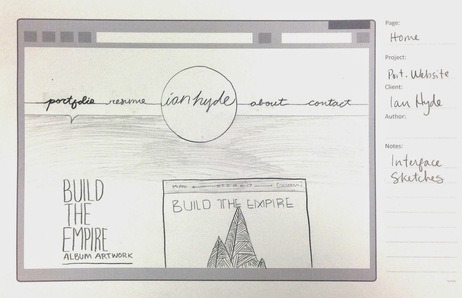
Here are some portfolio sites that I found and admire:
Thursday, April 10, 2014


Subscribe to:
Posts (Atom)